St. Vital Centre
This is an archived version of this project. It represents an previous iteration of the site, and is kept for historical purposes. Click here to see the latest version.
- Calendar of events with social media sharing
- Catalyst 4 content management system
- Customizable colour themes based on date ranges
- Live twitter feed sidebar
- Responsive design
- Scalable vector graphics directory map
Style And Convenience
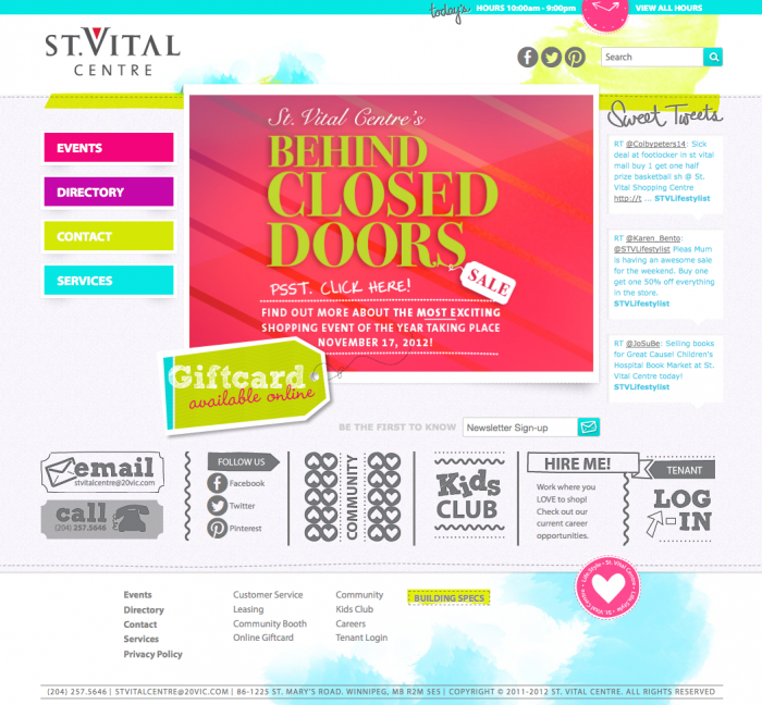
A stunning example of design and functionality fully cooperating. Working alonside Fusion, we built an easy-to-use content-management system that powers an easy-to-navigate public website. Elements embrace cutting-edge industry standards like SVG, jQuery, and Twitter without sacrificing useability or accessibility. And pre-built flexibility in the CSS and design allows the site to refresh and remain fresh.
Colours
And Themes
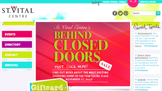
The bright colours, brushed backgrounds, and eye-catching banner art are all themeable through the Catalyst administrative system. New themes for seasons, holidays, or special events can be applied with ease.
We built the individual site elements to work with these themes, rather than around it. The colour at the top reveals the full hours of operations, including holiday hour changes and short announcements. The sidebar pulls Twitter posts and mentions right from St. Vital Centre's profile. And the scrolling banner can be targetted to the home page, to any individual pages, or across the whole site.
You Are Here
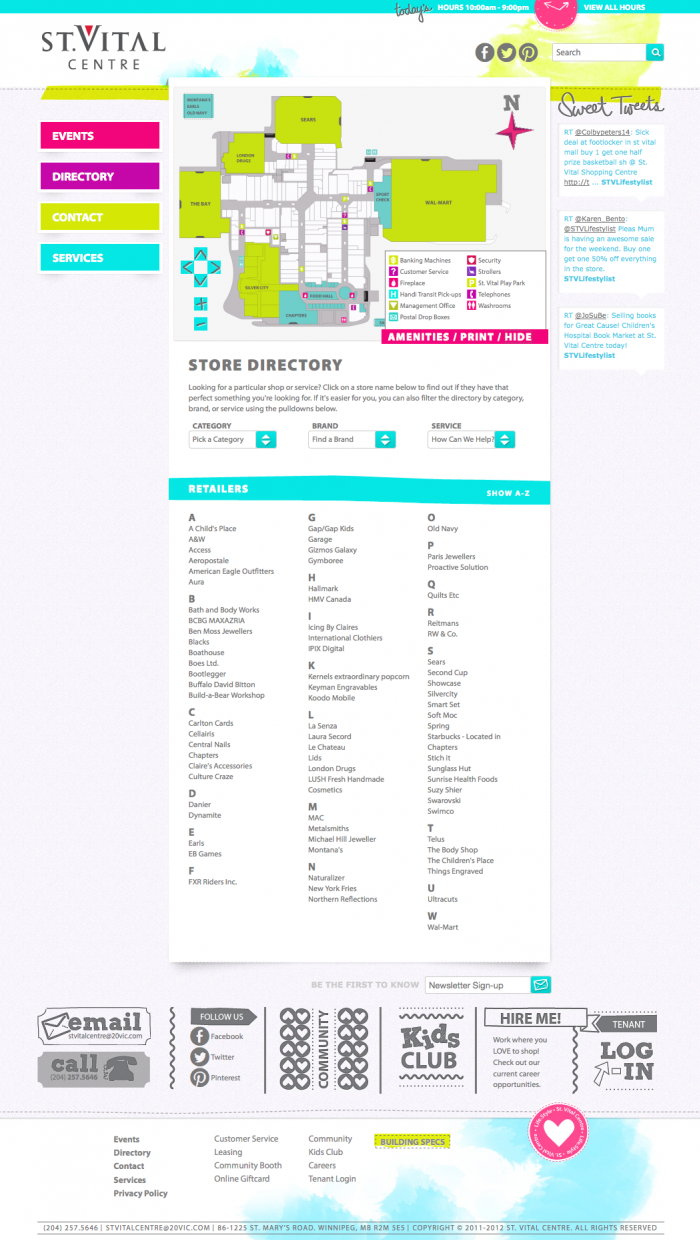
Keeping up with web standards, St. Vital Centre employs a vector-based map built on scalable vector graphics. This allows the map to be zoomed or panned as desired without any loss of definition. Tied in with jQuery, mall tenants can be focused/labelled, the entire map can be themed dynamically with colors inherited from the layout, and amenities can be hightlighted upon request.
And it looks just as sharp on high-resolution displays as it does on standard computer monitors! Any browser that doesn't yet support SVG natively will still get a perfectly functional Flash-based alternative.
The best part is that it works on your iPhone. Thanks to a responsive design, the website lays out in an alternate, clearer way to accomadate the smaller physical size of your smartphone. With modern web standards supported, the SVG map appears fully functional in your hand as it does on your screen!
Join The Kids Club
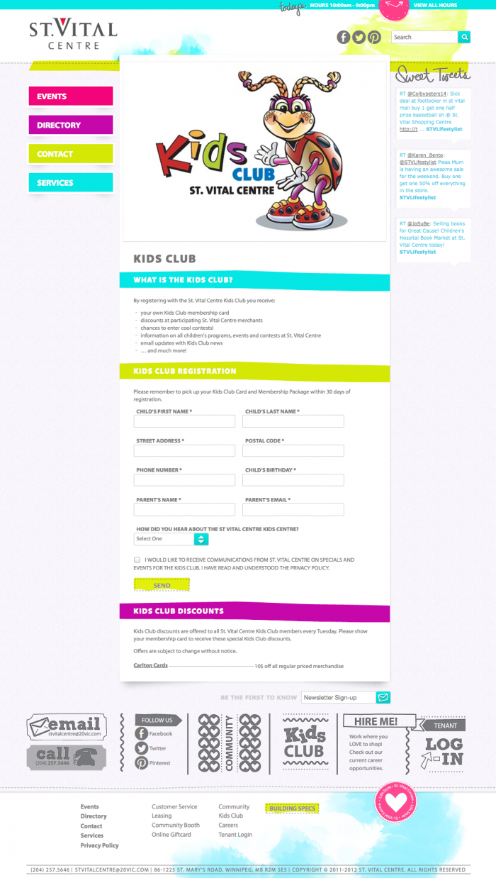
Registering for the "Kids Club" is a snap! A custom built form gently validates submitted information and sends a notification via email to a St. Vital Centre represenative. Behind the scenes, an adminstrative tool allows easy sorting and filtering of registrations, allowing them to respond to questions and requests more efficently.
Your Foot
In The Door
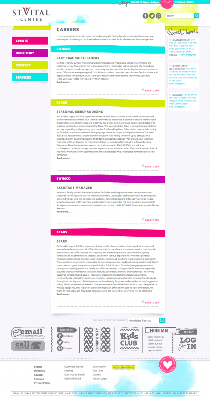
St. VItal Centre and its tenants invite you to be part of their working family. The careers page posts opportunites for the mall or any number of the individual tenants.
All postings are formatted for maximum readability, with requirements and contact information clearly laid out. An editable deadline acts both as display information and an automated way to have individual archived.
Act quick!
Come Join Us
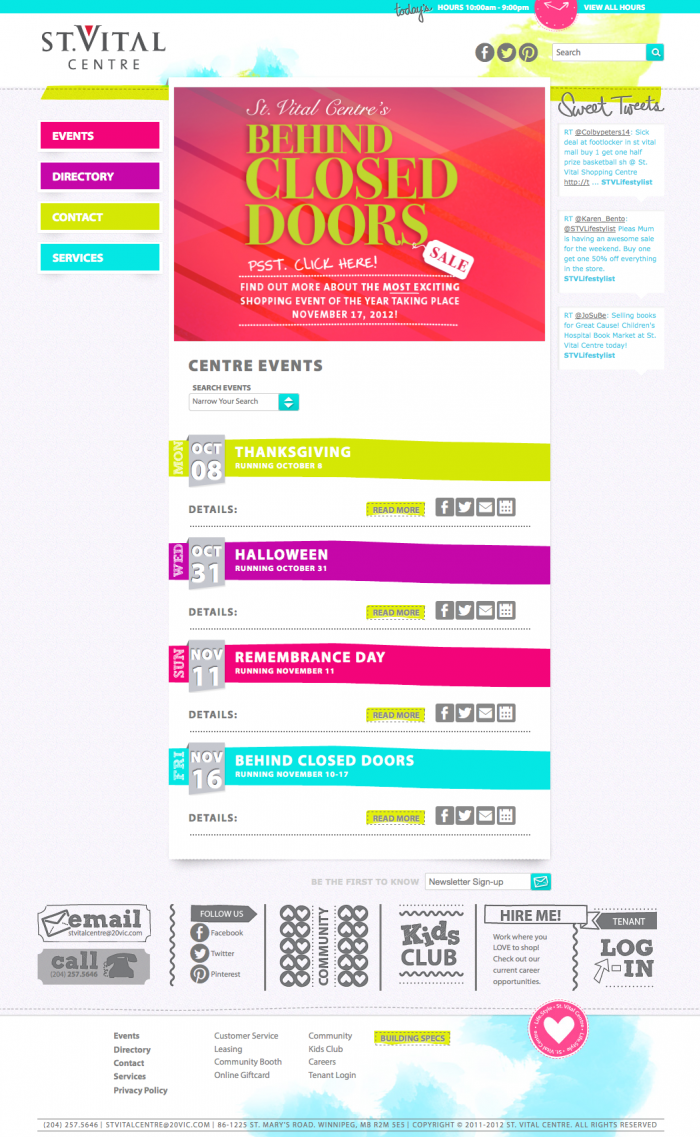
The calendar of events works to bring together the mall, its tenants, and its visitors. St. Vital Centre can easily post any number of individual events, either one-day surprises or week-long sales promotions. Each event can be associated with any number of individual tenants, with those events appearing on those tenants' profile pages.
To make it easier to attend, the St. Vital Centre website provides multiple ways for you to share and follow each event. Twitter, Facebook, Email, and iCal are all available, for you and your friends. See you there!
Hearing From You
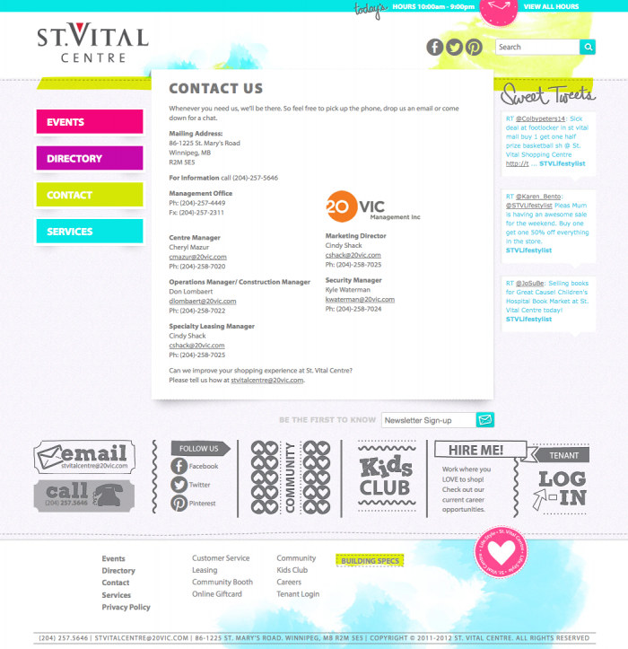
Get ahold of the right people thanks to well-presented content. The Catalyst system provides a fully functional what-you-see-is-what-you-get editor that allows site administrators to manage their copy and format it as they need. Bolding, italics, web links, images, file downloads, and much more, all without going against the website's consistent, professional design.
Formatted To
Fit Your Screen
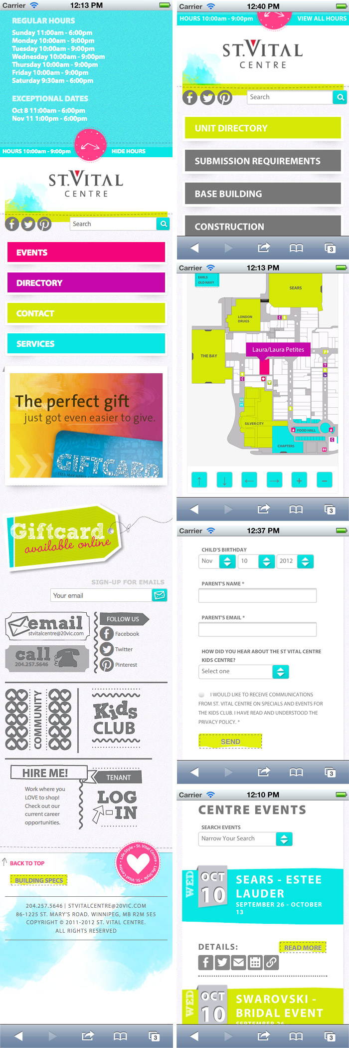
If you fire up the St. Vital Website on your mobile device, you'll see all the same content laid out just a little differently.
Using modern responsive design techniques gives us the capability to provide the same site with the same great content, but with special stylesheets to format the layout for the physically smaller displays. Everything works just like it does on your desktop or laptop, including the SVG map and all the web forms, but purposely scaled so that its easier to access with your fingers.
It's that tiny extra effort that makes a big difference on your small screens.
Let Sparks Fly
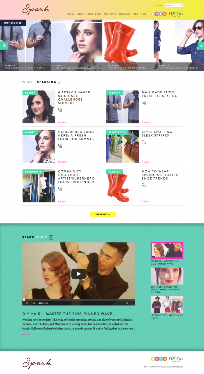
Spark is a fashion and lifestyle blog presented by the fine folks at St. Vital Centre. They needed an alternate look for the site, and some new tools with a focus on social media and personal engagement. We set up a new area that lets them draft articles, upload picture slideshows, feature online video, and encourage discussions with Disqus.